Culture at the Centre of Branding
Connecting brand identities with the cultures they serve
A brand can have a compelling proposition, a distinctive visual identity and a clear position in its category. But to mean something to people, it needs to connect with the world they live in: their experiences, their values, their references and the things that make them feel they belong.
Culture provides that connection. It gives brands a shared language, a sense of place and a way of building relationships that go beyond the products and services they sell.
At Seven Brands, our work with four telecommunications brands across Singapore, Nigeria and the Middle East has explored different ways of putting culture at the centre of branding. From architectural heritage and textile traditions to geometric patterns and the symbolism of luck, each project demonstrates how cultural understanding can create brands that are not only distinctive, but meaningful to the people they serve.
The principle is simple: culture shouldn't be something a brand borrows for decoration. It should be something that gives the brand meaning.
StarHub: Seeing ourselves in the story
In 2020, StarHub celebrated its 20th anniversary. To mark the occasion, Seven created Celebrating 20 Years and You, a campaign celebrating the people who had been part of the company's journey from challenger to one of Singapore's leading telecommunications providers.
Rather than making the anniversary solely about corporate achievements, we wanted to celebrate what StarHub had brought to people's lives.
The creative idea drew inspiration from the distinctive Peranakan windows found in Singapore's traditional shophouse architecture. Peranakan culture, shaped by generations of cultural exchange, has a rich visual heritage expressed through intricate patterns, vibrant colours and decorative craftsmanship. Its architectural details remain a distinctive part of Singapore's cultural landscape.
We transformed these windows into visual devices, framing images of customers and employees within the campaign identity. The window became a metaphor for the relationship between StarHub and the people it served: a way of looking into the brand's history through the lives of its customers.
This was more than a visual reference to Singaporean heritage. It gave the campaign its central idea. The anniversary wasn't simply about 20 years of StarHub, but 20 years of what StarHub had brought to people.
By drawing on a recognisable element of local culture, we created a campaign that felt rooted in Singapore and invited people to see themselves in the brand's story.
9mobile: Expressing the Naija Spirit
In Nigeria, the challenge was different. 9mobile needed to stand apart in a highly competitive telecommunications market dominated by larger, better-funded players. The opportunity lay in building a brand with a distinctive personality and a stronger emotional connection to a younger, digitally connected audience.
The strategy embraced the Naija Spirit: a celebration of youth, culture and self-expression.
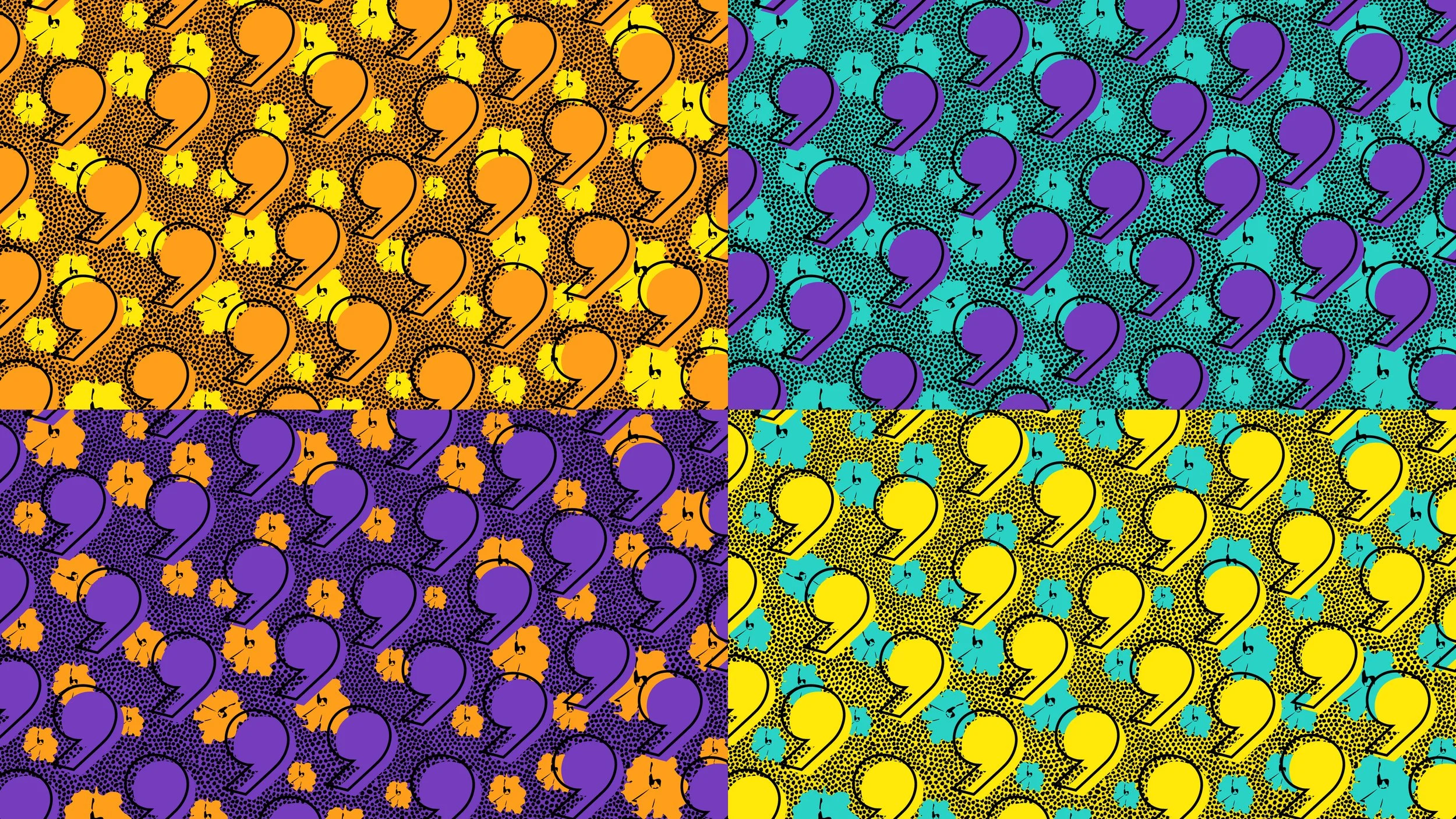
One source of creative inspiration was Ankara fabric, renowned for its bold colours and expressive patterns and widely associated with African fashion and contemporary cultural identity. Its energy offered a way to move beyond the visual conventions of the telecommunications category and create a brand that felt vibrant, confident and unmistakably expressive.
The resulting identity combined a bold, multi-coloured palette, expressive typography and a flexible system of graphic elements called Vibes. Designed to work across digital, social, retail and internal communications, the system gave 9mobile a recognisable visual language without restricting its ability to evolve.
The ambition was to create more than a telecommunications brand. It was to express an attitude that resonated with the aspirations and individuality of its audience.
Here, culture wasn't simply an aesthetic influence. It helped define the brand's character, giving it a way to connect with people through shared energy and contemporary expression rather than category conventions.
Zain: Turning cultural patterns into brand assets
For Zain, cultural inspiration became a powerful tool for both regional relevance and brand recognition.
Drawing on Islamic geometric patterns, we developed a distinctive system of Arabesque-inspired pattern elements. These were designed to work as an integral part of the brand's visual identity, creating a recognisable language that could extend beyond the logo itself.
The pattern elements were trademarked by Zain and became significant brand signposts. Their strength lies in their ability to identify the brand even when its logo isn't visible. Cover up the logo on a piece of Zain communication, and the patterns can still tell you who's speaking.
That's a compelling test of strong branding. A brand identity becomes truly distinctive when its recognition doesn't depend on a single mark, but on a coherent system of visual assets that people learn to associate with it.
The cultural dimension is equally important. Rooted in a visual tradition with deep significance across the region, the patterns helped Zain feel relevant to the markets it served, including Kuwait, Bahrain, the Kingdom of Saudi Arabia, Iraq, Jordan, Sudan and South Sudan.
Rather than imposing a generic international identity, the brand drew on a shared cultural visual language to build familiarity and connection across diverse markets.
Zain demonstrates that cultural relevance and commercial effectiveness aren't competing objectives. When a cultural reference is developed into a distinctive, ownable brand asset, it can deliver both.
Eight: Making luck a shared language
Also in Singapore, StarHub set out to launch Eight, a new mobile virtual network operator (MVNO) brand aimed at price-sensitive older Singaporeans and expatriate workers.
The challenge was to create a brand that was accessible and commercially competitive, but also culturally resonant in one of the world's most multicultural societies.
The answer was luck.
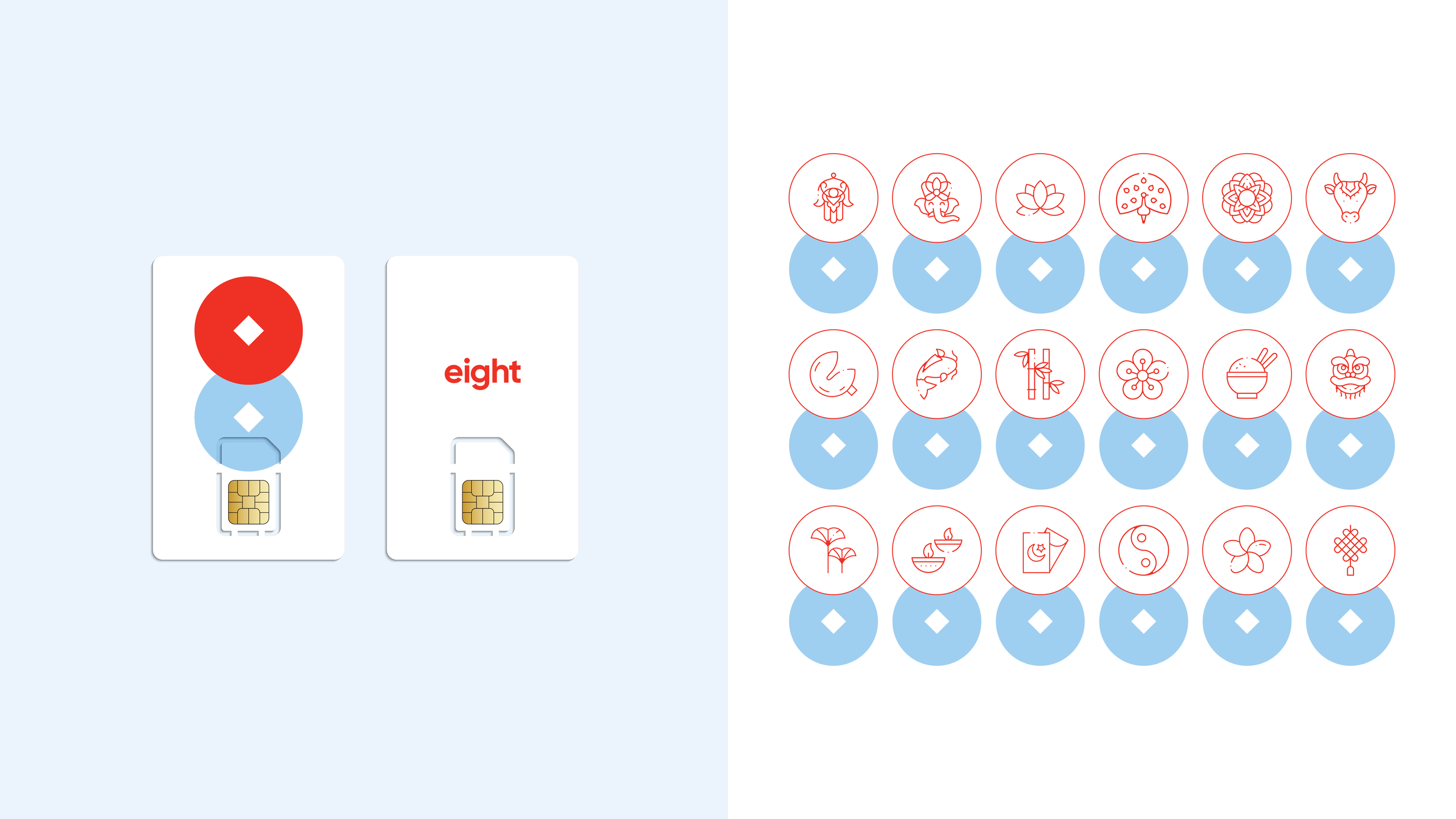
Built around the idea Live Lucky, Eight drew on the symbolism of auspicious Chinese numerology, where the number eight is traditionally associated with prosperity and good fortune. But the identity looked beyond a single cultural reference, drawing inspiration from the iconography and traditions of Singapore's Chinese, Malay, Indian and Sri Lankan communities.
We created a collection of icons that brought this idea to life, ranging from goldfish to Ganesha. Together, they formed a playful, welcoming visual language that reflected the cultural diversity of the audience Eight wanted to reach.
The result was a brand built around a universal human aspiration - good fortune - expressed through references that could feel familiar to different communities.
Eight shows how cultural understanding can help a brand connect with a broad audience without losing its focus. Rather than treating multiculturalism as a challenge to be navigated, the identity made it a source of personality, warmth and relevance.
Culture is more than a visual choice
These four brands operate in different markets and address different audiences, yet they share an important principle: their identities are stronger because they are connected to something beyond the category.
Culture can provide a framework for storytelling, as it did with StarHub. It can give a brand its attitude, as with 9mobile. It can create distinctive, ownable assets, as with Zain. And it can build bridges across diverse communities, as with Eight.
But cultural relevance requires more than finding a pattern, symbol or tradition that looks interesting. It demands an understanding of what those references mean, who they belong to and how they can be used respectfully and purposefully. The aim isn't to borrow culture to make a brand look local. It's to build a brand that feels like it belongs.
When culture informs the thinking behind a brand, its strategy, personality, visual language and behaviour, it becomes much more than an aesthetic decision. It becomes a source of differentiation, recognition and emotional connection.
Ultimately, the strongest brands don't just tell people who they are. They show people that they understand who they are.
And that's where culture moves from the margins of branding to its very centre.
Culture in Practice
From Singapore to Nigeria and across the Middle East, our work shows how cultural understanding can shape distinctive brand identities, create meaningful connections and help brands stand apart. Explore the four projects below to see how these principles come to life in practice.